Background on Patients
knitr::opts_chunk$set(echo = TRUE, message=FALSE,warning = FALSE)

# Libraries
library(tidyverse)
## ── Attaching core tidyverse packages ──────────────────────── tidyverse 2.0.0 ──
## ✔ dplyr 1.1.0 ✔ readr 2.1.4
## ✔ forcats 1.0.0 ✔ stringr 1.5.0
## ✔ ggplot2 3.4.1 ✔ tibble 3.1.8
## ✔ lubridate 1.9.2 ✔ tidyr 1.3.0
## ✔ purrr 1.0.1
## ── Conflicts ────────────────────────────────────────── tidyverse_conflicts() ──
## ✖ dplyr::filter() masks stats::filter()
## ✖ dplyr::lag() masks stats::lag()
## ℹ Use the ]8;;http://conflicted.r-lib.org/conflicted package]8;; to force all conflicts to become errorslibrary(dplyr)
library(haven)
library(ggplot2)
library(tidyr)Import data
Read in the dataset.
df <- read_sav("~/Desktop/Coding/data/Mothership_DV.sav")
Mothership<-select(df,ID1:Sexuality_1,MDD_C:Day40_CUXOS,SUMdep_0:SUManx_1,SUMdep_DC,SUManx_DC,BL_CUDOS, BL_CUXOS)
view(Mothership)
Rename and Recode variables
We can change the current variables to make them easier to interpret.
#recode varaibles
Mothership <- mutate(Mothership,
                     DC_status_1 = as.factor(DC_status_1),
                     DC_status_1 = recode(DC_status_1,
                                          "1"="Complete",
                                          "2"="Nearly Complete",
                                          "3"="Insurance",
                                          "4"="Nonatteneance",
                                          "5"="Inappropriate",
                                          "6"="Inpatient",
                                          "7"="Withdrew",
                                          "8"="Dissatisfaction",
                                          "9"="Other"),
                     Education_1 = as.factor(Education_1),
                     Education_1 = recode(Education_1,
                                          "1"="<Grade 12",
                                          "2"="HS Diploma",
                                          "3"="GED",
                                          "4"="Some College",
                                          "5"="Associates Degree",
                                          "6"="Bachelors Degree",
                                          "7"="Some Grad School",
                                          "8"="Grad Degree"),
                     Gender_1 = as.factor(Gender_1),
                     Gender_1 = recode(Gender_1,
                                       "0"="Female",
                                       "1"="Male",
                                       "2"="Non-Binary",
                                       "3"="Other",
                                       "4"="Unknown"),
                     Relationship_1 = as.factor(Relationship_1),
                     Relationship_1 = recode(Relationship_1,
                                             "0"="Married",
                                             "1"="Cohabitating",
                                             "2"="Widowed",
                                             "3"="Separated",
                                             "4"="Divorced",
                                             "5"="Never Married"),
                     Sexuality_1 = as.factor(Sexuality_1),
                     Sexuality_1 = recode(Sexuality_1,
                                          "1"="Straight",
                                          "2"="Gay",
                                          "3"="Bisexual",
                                          "4"="Other"),
                     IPT_track_1 = as.factor(IPT_track_1),
                     IPT_track_1 = recode(IPT_track_1,
                                          "0"="General",
                                          "1"="Trauma",
                                          "2"="Young Adult",
                                          "3"="BPD"),
                     Race_1 = as.factor(Race_1),
                     Race_1 = recode(Race_1,
                                     "0"="White",
                                     "1"="Black",
                                     "2"="Hispanic",
                                     "3"="Asian",
                                     "4"="Portugese",
                                     "5"="Other"),
                     Education_1 = as.factor(Education_1),
                     Education_1 = recode(Education_1,
                                      "0"="<Grade 6",
                                      "1"="Grades 7-12",
                                      "2"="HS Diploma",
                                      "3"="GED",
                                      "4"="Some College",
                                      "5"="Associates Degree",
                                      "6"="Bachelors Degree",
                                      "7"="Some Grad School",
                                      "8"="Grad Degree"),
                     DC_status_1 = as.factor(DC_status_1),
                     DC_status_1 = recode(DC_status_1,
                                      "1"="Treatment Complete",
                                      "2"="Treatment Near Complete",
                                      "3"="Insurance Stopped",
                                      "4"="Nonattendence",
                                      "5"="Inapproparite Language",
                                      "6"="Transfered To Impatient",
                                      "7"="Withdrew for External factors",
                                      "8"="Withdrew (AMA)",
                                      "9"="Other",
                                      "10"="Other"),
                    DC_status_1 = as.factor(DC_status_1),
                    DC_status_1 = recode(DC_status_1,
                                      "1"="Inpatient",
                                      "2"="PHP",
                                      "3"="APS",
                                      "4"="Psychatrist",
                                      "5"="PCP",
                                      "6"="Another Physican",
                                      "7"="Therapist",
                                      "17"="Other"
                    ),

#Lets make some new variables
      #Duration of treatment
                     Duration = as.factor(
                       ifelse(Days_complete_1>0 & Days_complete_1 <=5, "1",
                       ifelse(Days_complete_1>5 & Days_complete_1 <=10, "2",
                       ifelse(Days_complete_1>10 & Days_complete_1 <=15, "3", "4"
                              )))),
                    Duration = recode(Duration,
                                      "1"="1-5",
                                      "2"="6-10",
                                      "3"="11-15",
                                      "4"="16+"
                                      ))

#Extract Year From Intake Date
#Convert to Date
library("lubridate")
Mothership$Intake_1<-ymd(Mothership$Intake_1)
Mothership$TxYear<-as.numeric(format(Mothership$Intake_1,"%Y"))
Mothership<-mutate(Mothership,
                   TxYear = as.factor(TxYear),
                   TxYear = recode(TxYear,
                                   "1582"="2014",
                                   "2021"="2020",
                                   "2022"="2020"))
Export as CSV
write.csv(Mothership,"~/Desktop/Coding/data/Mothership_Vis.csv")Sociodemographic Visualizations
Education Status
ggplot(data = subset(Mothership, !is.na(Education_1)),mapping = aes(x = Education_1))+
  geom_bar(color = "black",fill="darkred")+
  ggtitle("Frequency of Education Level") +
  theme(axis.text.x = element_text(angle = 45,hjust = 1))+
  xlab("Education Level")+
  theme(panel.grid.major.y = element_line(color = "grey",size = 0.5,linetype = 2))+
  theme(panel.background=NULL)+
  scale_y_continuous(name = "Frequency",limits=c(0,3000))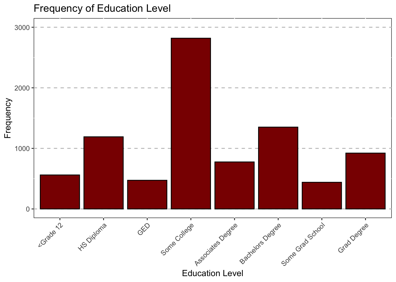
Race
ggplot(data = subset(Mothership, !is.na(Race_1)),mapping = aes(x = Race_1))+
  geom_bar(color = "black",fill="darkblue")+
  ggtitle("Frequency of Race/Ethnicity") +
  theme(axis.text.x = element_text(angle = 45,hjust = 1))+
  xlab("Race")+
  theme(panel.grid.major.y = element_line(color = "grey",size = 0.5,linetype = 2))+
  theme(panel.background=NULL)+
  scale_y_continuous(name = "Frequency",limits=c(0,6500))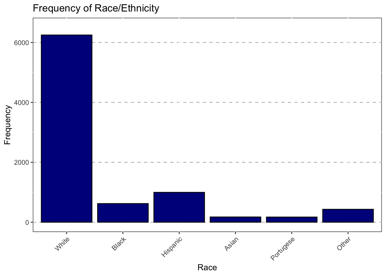
Gender
ggplot(data = subset(Mothership, !is.na(Gender_1)),mapping = aes(x = Gender_1))+
  geom_bar(color = "black",fill="darkorange")+
  ggtitle("Frequency of Gender") +
  theme(axis.text.x = element_text(angle = 45,hjust = 1))+
  xlab("Gender")+
  theme(panel.grid.major.y = element_line(color = "grey",size = 0.5,linetype = 2))+
  theme(panel.background=NULL)+
  scale_y_continuous(name = "Frequency",limits=c(0,6500))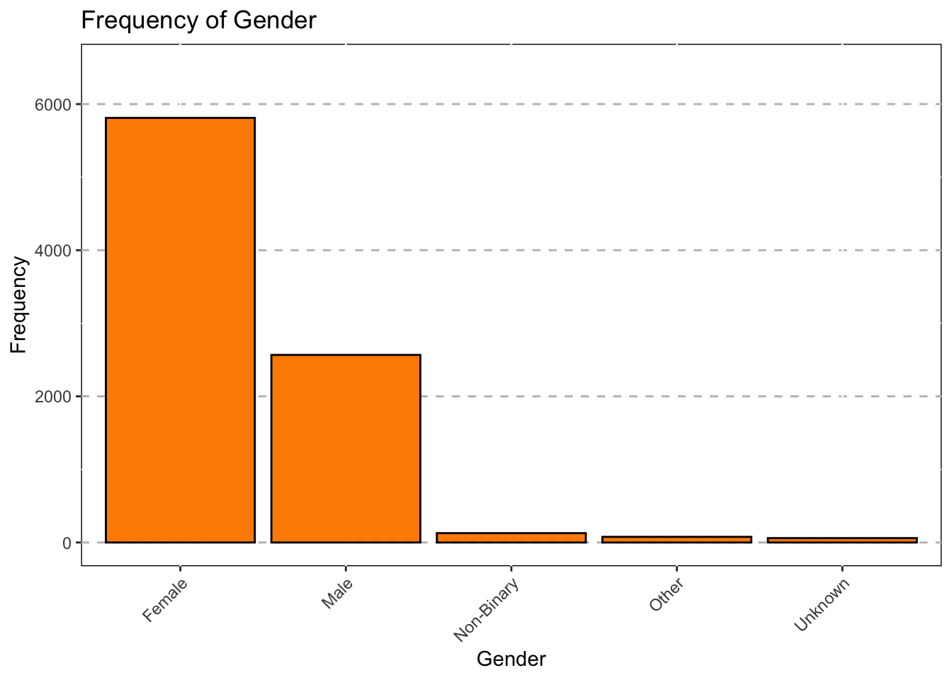
Pie Chart For Education Status
We wanted to learn how to make a pie chart in R so here is one!
#Create Table and Data Frame
Education<-table(Mothership$Education_1)
Education_df<-as.data.frame(Education)
Education_df
## Var1 Freq
## 1 <Grade 12 561
## 2 HS Diploma 1191
## 3 GED 473
## 4 Some College 2819
## 5 Associates Degree 776
## 6 Bachelors Degree 1351
## 7 Some Grad School 440
## 8 Grad Degree 922#Rename Columns
colnames(Education_df)[1]="Category"
colnames(Education_df)[2]="Frequency"
Education_df$Category=recode(Education_df$Category,
"0"="<Grade 6",
"1"="Grades 7-12",
"2"="HS Diploma",
"3"="GED",
"4"="Some College",
"5"="Associates Degree",
"6"="Bachelors Degree",
"7"="Some Grad School",
"8"="Grad Degree")
ggplot(data = Education_df, mapping = aes(x="", y=Frequency, fill=Category))+
geom_bar(stat="Identity",width=1,color="white")+
ggtitle("Education Level of Patients") +
scale_fill_discrete(name = "Education") +
coord_polar("y",start=0)+
theme_void()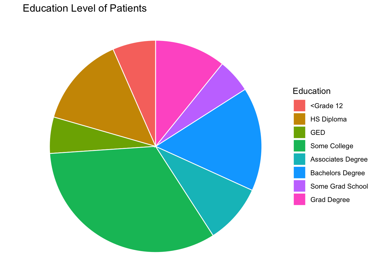
Treatment Related Visualizations
Discharge Status
### Bar Chart for Discharge Status ###

ggplot(data = subset(Mothership, !is.na(DC_status_1)), mapping = aes(x = DC_status_1))+
  geom_bar(color = "black",fill="darkgreen")+
  ggtitle("Frequency of Treatment Discharge Status") +
  theme(axis.text.x = element_text(angle = 45,hjust = 1))+
  xlab("Discharge Status") +
  theme(panel.grid.major.y = element_line(color = "grey",size = 0.5,linetype = 2))+
  theme(panel.background=NULL)+
  scale_y_continuous(name = "Frequency",limits=c(0,6000))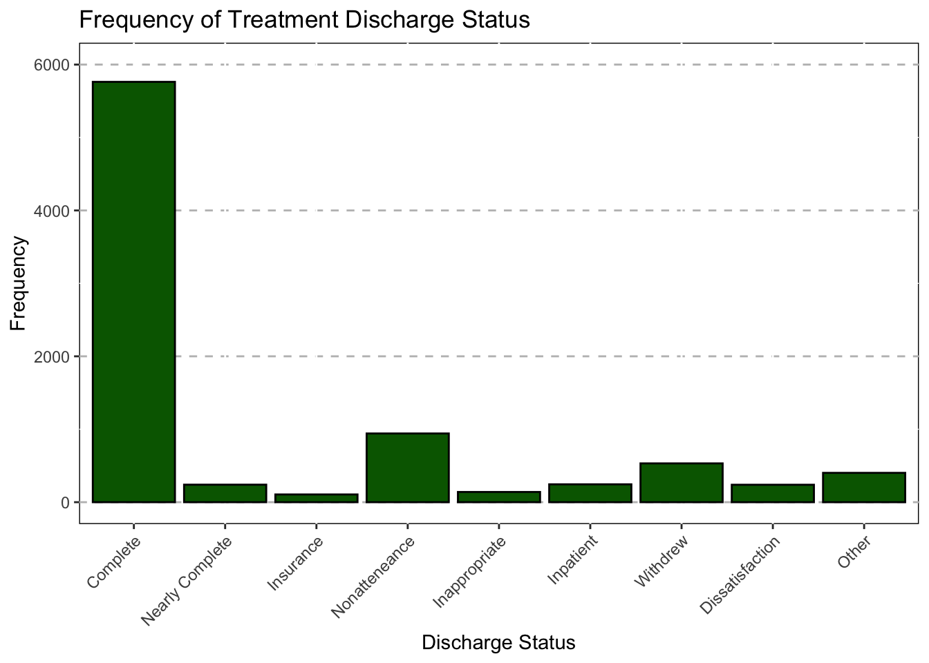
Treatment Track
### Treatment Track ###

ggplot(data = subset(Mothership, !is.na(IPT_track_1)),mapping = aes(x = IPT_track_1))+
  geom_bar(color = "black",fill="skyblue")+
  ggtitle("Frequency of Treatment Type") +
  theme(axis.text.x = element_text(angle = 45,hjust = 1))+
  xlab("Treatment Type")+
  theme(panel.grid.major.y = element_line(color = "grey",size = 0.5,linetype = 2))+
  theme(panel.background=NULL)+
  scale_y_continuous(name = "Frequency",limits=c(0,6500))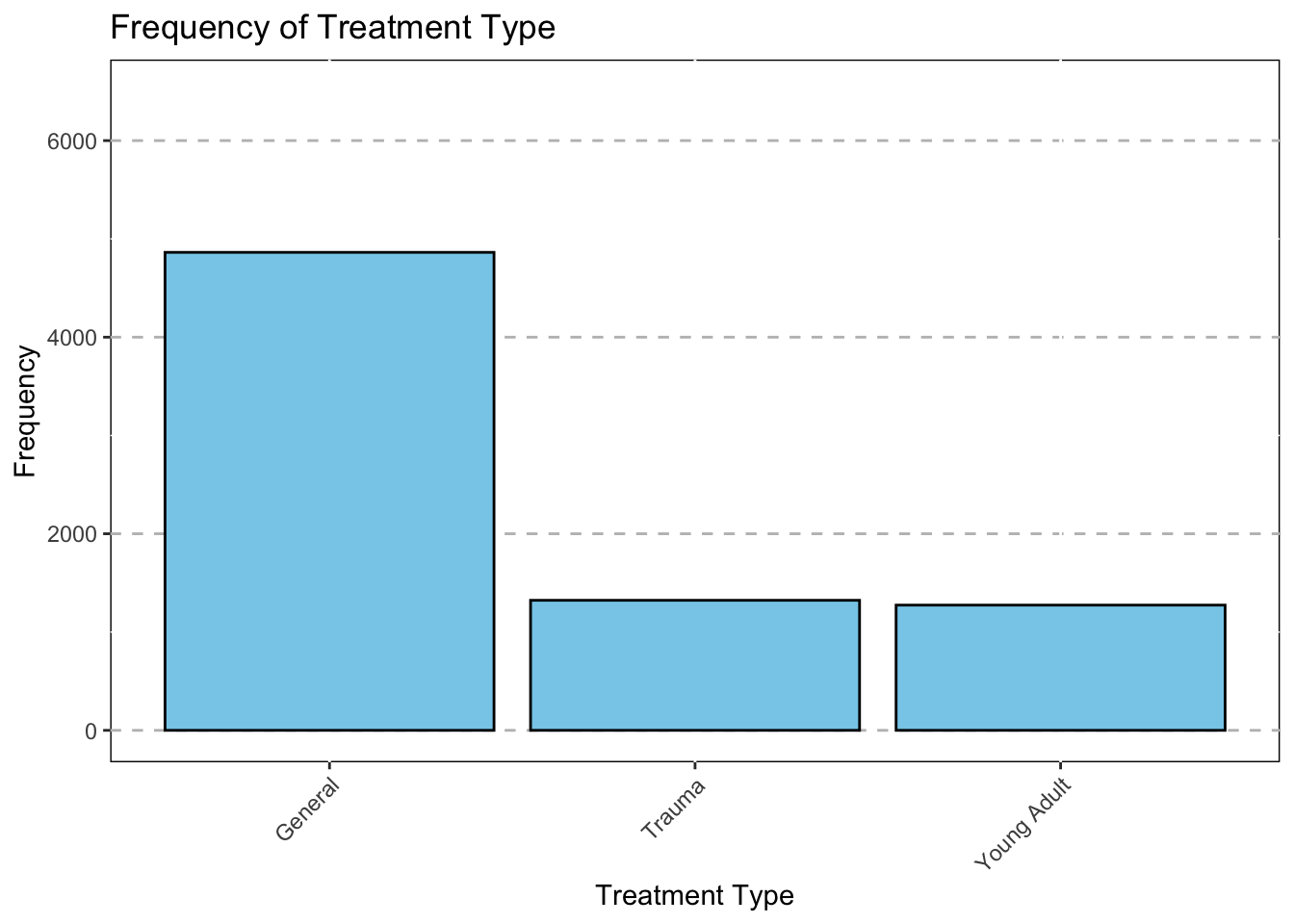
Treatment Year
### Treatment Year ###

ggplot(data = subset(Mothership, !is.na(TxYear)),mapping = aes(x = TxYear))+
  geom_bar(color = "black",fill="#9350C7")+
  ggtitle("Frequency of Patients per Year") +
  theme(axis.text.x = element_text(angle = 45,hjust = 1))+
  xlab("Treatment Year")+
  theme(panel.grid.major.y = element_line(color = "grey",size = 0.5,linetype = 2))+
  theme(panel.background=NULL)+
  scale_y_continuous(name = "Frequency",limits=c(0,1500))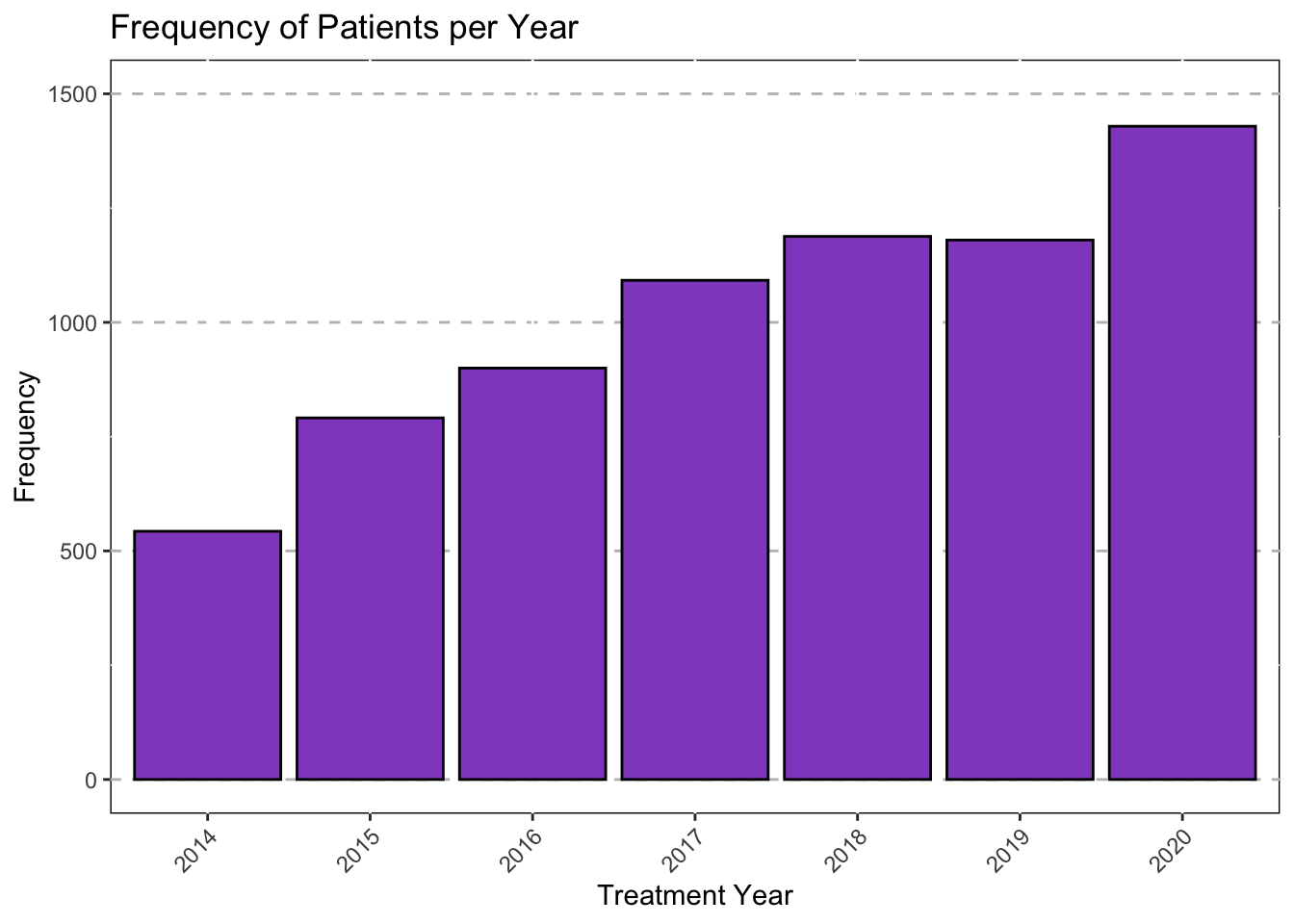
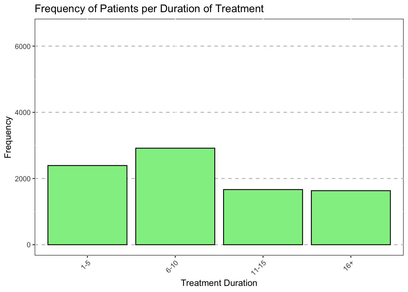
Duration of Treatment
### Duration of Treatment ###
ggplot(data = subset(Mothership, !is.na(Duration)),mapping = aes(x = Duration))+
  geom_bar(color = "black",fill="lightgreen")+
  ggtitle("Frequency of Patients per Duration of Treatment") +
  theme(axis.text.x = element_text(angle = 45,hjust = 1))+
  xlab("Treatment Duration")+
  theme(panel.grid.major.y = element_line(color = "grey",size = 0.5,linetype = 2))+
  theme(panel.background=NULL)+
  scale_y_continuous(name = "Frequency",limits=c(0,6500))